this is the link to the long awaited website
http://a2mediadjransome.weebly.com/
Friday, 6 May 2011
Wednesday, 4 May 2011
Evaluation question 4: How did you use new media technologies in the construction and research, planning and evaluation stages?
Over the course of this project we have used some new and interesting technology to help us with the production stage of our video. One of the main technologies used was the sound editing room. Although we didn’t produce our song in there we learnt how to use the sound boards and cubebase application to make songs and edit sounds recorded and even record our own voices on top of a song. The main thing we used the room for was to get the shots of the sound board which we used at the strongest points in our song. The next piece of technology that we used was the green screen. We used this whilst on our photo shoot so that we could put any image or video behind the images when applying them to the digipack and the website. Another piece of technology we used was a different editing software called Vegas pro which we used to create the bar that comes on the bottom at the beginning and end of the piece. This was not that challenging but any problems we encountered were easily resolved by watching tutorial videos on YouTube which help in the process of operating the program. When we created the website we used Dreamweaver which was very tricky to use and caused us so many problems that we went looking for an alternative. The technology we found was a website called weeblee which was recommended to us by our teacher. This was very easy to use and helped us immensely when trying to get the correct style to match the other parts of the project. Finally we have used the same technology from last year such as the cameras and adobe software but to a higher standard and encountered less problems due to a better knowledge of the equipment.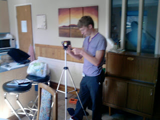

Evaluation question 3: What have you learned from your audience feedback?
For our project we knew that it was important to take note of what the audience wants from a music video. To do this we made a questionnaire and posted it on facebook to get some audience feedback on our project. From this questionnaire we discovered that the storyline behind the piece was important. Below is a link to the facebook page where our questionnaire is located.
http://www.facebook.com/apps/application.php?id=154333361271508#!/apps/application.php?id=154333361271508&sk=wall
After filming and editing our rough cut we handed a copy in to our teacher so that he could see what we had done and give us ideas on possible improvements. He pointed out a few errors which we were quick to change and gave use some important information regarding the rest of the video. Another member from a different school was in to look at our piece so we took the opportunities to take any further ideas and suggestions from him as well. He pointed out that the editing was to slow for the song we had chosen so we went back to the editing room and tried to add more cuts where needed and made sure they matched the time and beat of the song.
Evaluation question 2: How effective is the combination of your main product and ancillary texts?
During this project we have tried to make connections between the ancillary tasks and the main project. The first thing that we did was to come up with a common theme that follows the style of our music. What we came up with was a sound wave which we used on the website and on digipack. The next thing that we did is to use the artist in the video as we have seen done on many other examples of music videos. To keep the theme across the ancillary tasks we decided to use images of the artist on the website and the digipack. The main reason for this is because when we looked at other artist’s websites we noticed that they too had used images of themselves to allow viewers to know what the website is about. Next up is the costume. We watched other music videos and took note of the sorts of clothing that the artists were wearing. From this we decided to use stereotypical teenage clothing such as the hoodie and jeans. This therefore follows the trends seen in other music videos. The target audience for this piece is young teenagers so we needed to make sure that out ancillary tasks would appeal to the nature of the audience. To do this we decided to use graffiti art on the digipack to grab the attention of youths if seen on a shelf in the shops.
Evaluation question 1: In what ways does your media product use, develop or challenge forms and conventions of real media products?
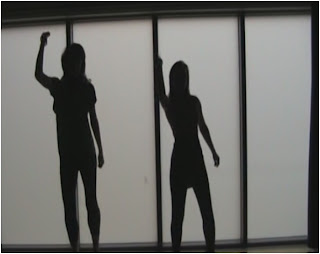
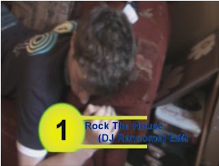
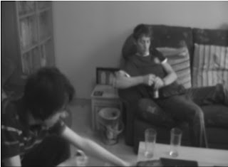
In our project we have used conventions from other music videos from the same music genre as our own song. This therefore enabled us to get a clearer picture as to what it is that is required from this particular type of video. First we noticed the use of female dancers which is also linked with voyeurism in most other club anthem videos (these videos can be found on earlier posts from this blog). From this we decided that it would be beneficial to follow this convention and use it in our project. To do this we asked a small group of dancers to choreograph a dance which we filmed and used in our final project. Another convention that we followed was the rating that appears at the start and end of the video. From watching the music channel we noticed that the position the song is in the charts and the name and artist were listed in an added bar at the bottom of the screen. We made sure that all of these features were included in our video so that it felt more like a music video than just a scene from a film. The next convention that we followed is a more common one and is the based on the flashbacks that the character has in the video. In most flashback scenes it is done in black and white so that the audience can tell that it is a flashback and not part of the story. We followed this by making sure that all of our flashback scenes were done in black and white to gain maximum effect from them. For the ancillary tasks we decided that using a similar pattern to the video was most appropriate as found on other songs. To do this we looked on other artist’s websites and looked to see what type of styles they used. From this we decided to have columns on the website and lots of images of the artist. We followed this trend by using lots of pictures of the artist on the digipack as well as following other standard conventions such as the barcode and cd holders.
Final Digipak
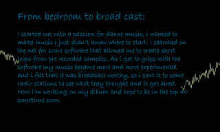
this is the information page of our digipack. it shows some infromation about howthe artist was formed
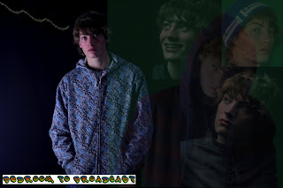
 this is another panel which has the grafitti art text on it to appeal to the youth tarhet audience its aimed at. also it has pictures of the artist so the listner can see what he looks like
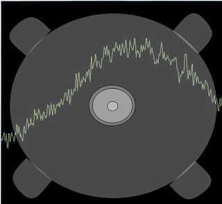
 this is another panel which has the grafitti art text on it to appeal to the youth tarhet audience its aimed at. also it has pictures of the artist so the listner can see what he looks like
this is a track list showing the various songs that are on the cd.

we used a barcode and stuck to the grafitti art idea to gain maximum potential from the cd cover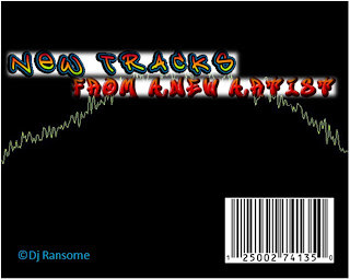

this is the front cover. after looking at other artists digipacks we noticed that they mostly have a picture of the artist on the front. to stick to the conventions of digipacks we also put an image of the artist on the front cover along with out grafitti art and sound wave whic are the ain links between the didipack panels and the website.
Tuesday, 5 April 2011
Tuesday, 29 March 2011
Final Website
http://a2mediadjransome.weebly.com/
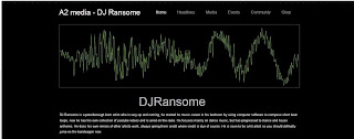 these are the three sections to our website.
 these are the three sections to our website.
we used similar patterns from the digipak on the website so that it would match and create a general theme for the music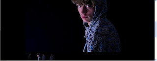 . we did this by using the sound wave from the digipak and the images of the artist also from the digipak. at the bottom of the page there is some videos of some songs already out from the artist. this is so that people will get a better feel for the style of the music and also to encourage them to buy it.
 . we did this by using the sound wave from the digipak and the images of the artist also from the digipak. at the bottom of the page there is some videos of some songs already out from the artist. this is so that people will get a better feel for the style of the music and also to encourage them to buy it.
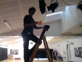
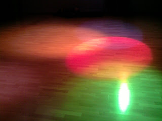
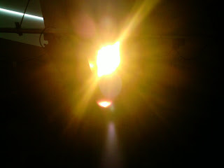
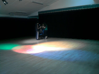
this is a group of photos showing the filming day for our dance scene. for this to be effective we decided to use lights hat were in the dance studio. we had to put in filters and move them to the places that looked best for us.
the filming went really well and we got all of the shots need for our project.
Thursday, 24 March 2011
dance
we have looked at our footage and noticed that it is very short and needed some more interesting shots. we have approached some dancers and asked if they would choreograph a dance for some small sections of our piece.
setting up our shoot
for our filming we needed to make sure that it look realistic so we bought some fizzy drinks and biscuits and scatterd them around the room. we also made sure that we remembered where everything was in case we would need to refilm any of the video.
photoshoot
this is a photo that we took whilst playing around with the different styles of lighting. it was done on a black backdrop and looks very effective.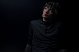

Green screen
we have done some green screen images and played around with them in the editing software.
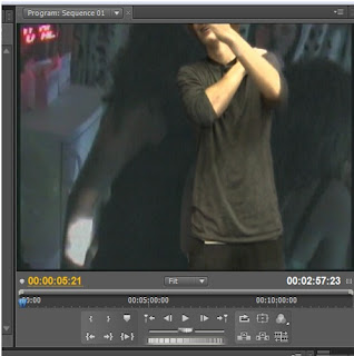 this is the final out come of our green screen video
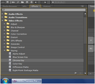
this is the tool we used to create the effect we also had to ajust the settings so that we got the best look for our video.
Although we wont use this in our final project it is good practice for the photoshoot that we are going to do soon.
storyboard for final idea
the next stage for our new idea is to design a storyboard to dictate our events.
new idea
After looking at the of com regulations we have found many floors in all of our ideas. we thought about using a poker scene but underage gambling was an issue. so we decided that we could do a morning sequence following up say a party from the night before. this was our best idea yet as it follows all of the of com rules and therefore is perfect for our project.
Subscribe to:
Comments (Atom)


