 this is another panel which has the grafitti art text on it to appeal to the youth tarhet audience its aimed at. also it has pictures of the artist so the listner can see what he looks like
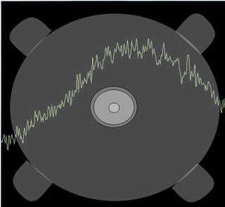
this is a track list showing the various songs that are on the cd.
we used a barcode and stuck to the grafitti art idea to gain maximum potential from the cd cover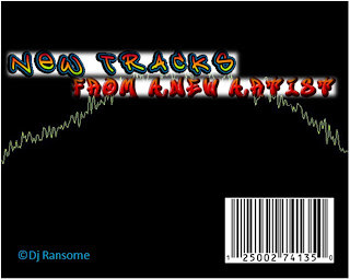

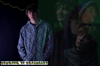
this is the front cover. after looking at other artists digipacks we noticed that they mostly have a picture of the artist on the front. to stick to the conventions of digipacks we also put an image of the artist on the front cover along with out grafitti art and sound wave whic are the ain links between the didipack panels and the website.


No comments:
Post a Comment